
This is really a no-brainer but nevertheless important, and actually something a lot of sites get wrong.
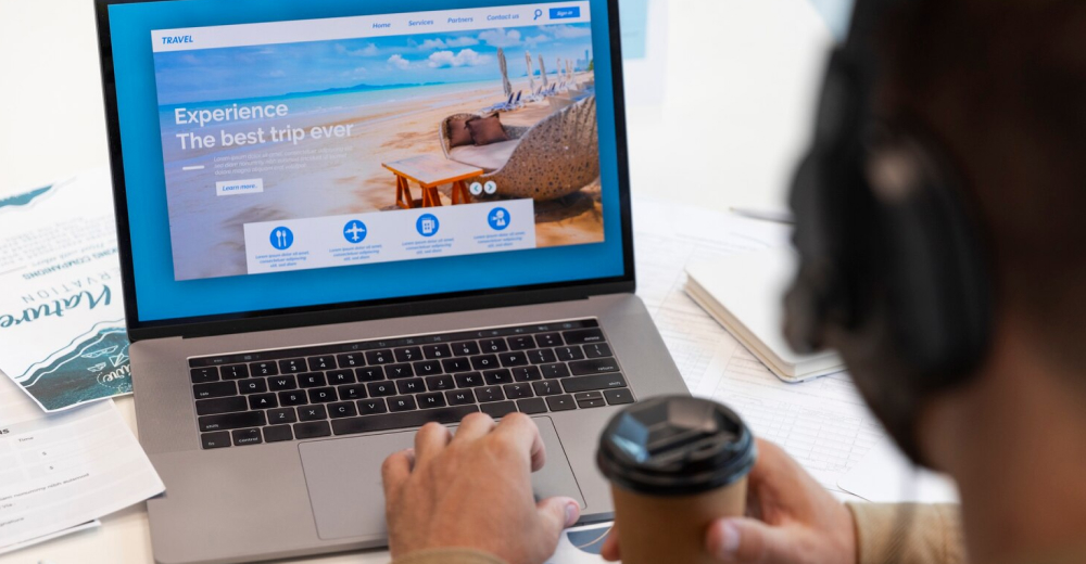
Imagine that you have an affiliate site for the travel industry. You write beautiful articles which vividly describes exotic places where people could spend their holidays. Sprinkled in the text you have affiliate links to traveling agencies, which in case you didn’t know, have pretty decent kick-backs on refered customers that leads to a sale.Now, the sole purpose of that article is to make people click those links. After all, that’s how you make money of the site. One thing you should definitely do is to make sure that people notices them. Because if the contrast between the links and the body text is to low, it doesn’t matter how eloquently you describe the destination. If they can’t see ‘em, they won’t click ‘em.
This might sound like common sense but you would be surprised to know how many sites that get this wrong. Often I think, for aesthetic reasons.
What to do about it
You don’t have to take it as far as usability guru Jakob Nielsen who infamously claimed that links should be blue and underlined (which they are on his site useit.com by the way). I don’t want to take it that far but do make sure that your links stand out from the rest of the text.
Your safest bet is probably to have them underlined. It carries a really strong affordance for clickability (check the Fast Facts Section for more on affordance). But you could also have them in a different color, a different background color and/or styled in some other way. Just make sure that they stand out from the rest of the text.
Don’t forget that as much as 8% [kolla fakta] of all men are color blind so having something more than just the color to distinguish links is a good idea.
Not just text links
The same thinking goes for other things that are clickable such as buttons, checkboxes, select lists, images etc. etc. Make sure that they actually look clickable.
For buttons that can mean to look like physical buttons with a 3d effect making them stand out from the page and look more like physical objects.
The button on the left could just as well be a banner or a header, while the button on the right is begging to be clicked.
Provide clues
Also make sure to provide other clues such as the cursor changes to a pointing hand and that something happens with the object when it’s being hovered. This is easily achieved with the :hover pseudoclass in the CSS.
.clickable-item:hover { cursor: pointer; background-color: #ff9; }
Don’t forget to design for touch
On touch devices there are no such things as a hover. It’s therfor extra important to make clickable objects look clickable.
Fast Facts
Affordance
The term Affordance was popularized by Donald Norman in his seminal book The Psychology of Everyday Things. He later changed the term to Percieved Affordance since too many misunderstood what he meant by it. (Actually his latest term for this is Signifiers but that term hasn’t gained much traction yet)
Percieved Affordance means what properties of an object we can learn by just looking at it. For example a door knob communicates with its shape that it can be grabbed and turned. In a similar way we can by just looking at a pair of scissors see that the shape of the two “holes” looks like somewhere you can put your thumb and your hand.
The door knob affords grabbing and turning and the pair of scissors affords sticking your hands in the holes. In the same way a underlined link and a raised button affords clicking (or touching).
References
Code Crafting Blueprints


 pushing Businesses towards Digitalization.jpg)